
Lynk & Co 09: Infotainment Interface Design
Intro


Lynk & Co is a Chinese-Swedish luxury automobile brand owned by Geely Automobile Holdings.
Brand’s Value: PERSONAL, OPEN, CONNECTED
Brand’s Goals: Change Mobility Forever
Brand’s Positions: Design, Value, Technology, Performance, Safety
Project Type: Automotive UI/UX | Competitive Analysis | User Research
My role: User research, UX design, prototype
The market of alternative-fuel vehicles in China:
In China, EV is not the future, it’s present. The market of EV and PHEV is huge and increasing rapidly.
“This year, a quarter of all new cars purchased in China will be an all-electric vehicle or a plug-in hybrid. By some estimates, more than 300 Chinese companies are making E.V.s, ranging from discount offerings below $5,000 to high-end models that rival Tesla and German automakers. ”
-The New York Times
Challenges
Current infotainment system integrates too many functions into a small touch screen.
Too many interactions lead to a complex menu.
Here are our client’s demands:
-
Reduce the learning curve for new users, create an easy-to-learn experience
-
Reduce hierarchy if necessary, improve the user flow
-
Explore the interaction with 3D elements
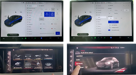
Competitive Analysis
I chose and compared several major competitors that are targeting similar consumers and have similar products with Lynk & Co in China, including:
-
Audi e-Tron
-
BMW i4
-
Mercedes-Benz EQS
-
Tesla Model 3
-
XPENG G9


After some test-drive, I found some valuable design features in those competitor’s car infotainment systems:
-
Hierarchy is user-friendly, both Tesla and XPENG use text and 3D animation to display menu
-
Switching between different menus is easy, BMW had editable widgets on homepage. Driver can set their preferred function on homepage for quicker access.
-
Most commonly used functions have good accessibility like Audi has a navigation button that can be accessed from anywhere.
Measure of Success
How to define our work if it’s doing well?
-
We will compare the user flow before and after to see what’s our improvement.
-
Does it shorten the hierarchy and improve the user flow
-
Does it clear confusion? Were they able to pinpoint actions, or did they have to go back and forth?
-
We will conduct a usability test to define the learning curve for new users. And we will compare the results.
-
Does it make it easier for the user to find a specific item
-
Does it simplify the learning curve and create an easy-to-learn experience
-
Does the icon work? Are they intuitive?
-
We will interview the user to see if they are satisfied with the design
-
Does the user feel they are using a luxury product?
-
How’s their learning experience?
Target Audience
User Demographic (From Lynk&Co customer survey)
-
Age: 30-45 years old
-
Gender: Male (Around 80%)
-
Occupation: White-collar workers/managers
-
Marriage: 76% married, with children
-
Income: 250k-500k CNY Annually (more than 50% of customers)

User Research


Secondary Research
Why we do it?
We don’t have access to the car or the infotainment system in the US.
How we do it?
We gather as much info as possible from the internet (google/baidu/YT) to see what people say about this product.
Our findings:
-
The AI assistant's location isn’t ideal
-
Using 3D model to guide users to find some functions is not straightforward
-
The way to use rendered images to navigate through interior functions is confusing
-
Too many hierarchies
5 Second Test
Why we do it?
We want to know how people will react to this image-focused UI, and how’s their learning curve.
How we do it?
We picked some commonly used functions, took a screenshot, and show to our test subjects to see how long they figure out the menu design.
Our findings:
-
Hard to figure out how to open the trunk using 3D model
-
The user can’t figure out the meaning of the white spots on an interior page
-
The “slider” in the exterior menu is confusing and hard to understand for a first-time user
-
The way to switch seats is confusing

Interviews
We interviewed some people that similar to Lynk & Co’s target audience to see how they use their cars in daily life.
Most common scenario:
-
Daily commute to work and back home alone
-
Go out for dinner with family members
-
Pick up children from school back home or to other places
-
Family road trip
-
Go to the charging station
Most used function:
-
Navigation
-
Media
-
Change driver profile
-
Adjusting seats, turning on seat heater/cooler
-
Turn on the driver assistant function
-
Check battery range and look for charging station

User Journey - Family Road Trip

Pain Points
-
Using 3D model to guide users to find some function isn’t straightforward enough, in many cases, users can’t figure out which part of the 3D model is connected to a certain function.
-
Many commonly used functions were hidden beneath multiple menu pages, and users spent too much time locating the toggle to turn it on.
-
Switching between different functions while driving is complicated, too many interactions are involved.
Solutions

Switching between function page
Adding a side tap bar to navigate users through multiple pages. When users enter the function page, they still can easily switch to another page.
Quick access widgets
Adding a quick access widget to some commonly used functions. For example: Seat heating/cooling. That way user can access the function without opening another menu.
Adding text on the interior image to guide users to open certain functions.

Wireframes

Hi-fi Prototype


Feedback and Final Thoughts

Client’s Feedback:
-
Enhanced Navigation Design: The original design relied too much on indexing and navigation, making it less intuitive. The new layout uses a three-column structure: primary navigation on the left, functionality in the center, and visuals on the right. Client is happy with the new immersive UI design.
-
Physical Button Consideration: Use solely physical buttons for volume adjustment to simplify interactions.
-
Gaming Experience: The client prefers a gaming-like feel for the system and suggests adding Z-axis movement to reduce complexity and layers.
What’s our next step?
-
Adjust based on the client’s feedback.
-
Design more flows of prototypes. Conduct a usability test next.
-
Compare the new user flow with the original design to see how’s the new learning curve.